Complex Forms - How To Simplify for Enterprise Softwares?
A comprehesive guide to designing effective forms. The guidelines listed are especially applicable to more complex contexts, such as long forms in enterprise systems.
Problem
Large organizations often provide extensive services, following complex business processes.
As they rush to release new features, usability is sometimes neglected because little or no time is spent on quality UX design, user research, and testing.
This leads to lower customer satisfaction and weakens the positive impact of the products on business goals.
After all, what’s the point of offering amazing features if they are hard to understand and use?
One common challenge is the complexity of enterprise software and long forms.
However, complexity can be reduced by breaking down tasks and flows into smaller, manageable chunks.
The smaller the task at hand, the easier it is for users to process and complete.
When designing for complexity, I often think of Miller’s Law: people can only hold a limited amount of information in their minds at once.
Why I Created This Resource?
I often spent hours — sometimes even days or weeks — searching for comprehensive, research-backed best practices for designing complex forms.
Sifting through countless articles, research papers, and expert opinions was time-consuming and overwhelming.
To solve this, I created this article as a go-to resource. It brings together the essential insights and best practices that consistently guide me when designing or improving complex forms.
I hope you find it useful too!
Now, let's take a look at the types of forms and how we can make sure the ones we create (or improve) are easy to use and understand.
Form Layouts
The three most common form layouts are Full Page, Side Panel and Modal.
Full Page Form Layout
Use when the form is lengthy, complex or has multi-steps.

Side Panel
Use when the user needs to reference information on the page.
.png)
Modal Form
Use for small and simple forms with no more than five fields.

Form Anatomy - Understanding Form Elements
Before designing a form, let's break it down into its main core components and understand how they work and which context they are most suitable for:

-
Labels – Clearly indicate what information the user should enter in a form field.
-
Text Inputs – Fields designed for short or long text entries.
-
Data Inputs – Various input types that enable users to provide information. Examples of such:
-
Checkboxes – Allow users to select multiple options from a list.
-
Radio Buttons – Present a set of mutually exclusive choices.
-
Dropdowns & Multi Selects – Let users choose one or multiple options from a list.
-
Toggles – Enable switching between two states, such as on/off or true/false.
-
File Uploader – Allows users to upload files.
-
Date Pickers – Facilitate the selection of a single date or a date range.
-
-
Help Texts – Provide guidance through inline hints, placeholders, or tooltips.
-
Errors & Validation – Display alerts that inform users of mistakes or missing information.
-
CTAs (Call-to-Actions) – Buttons that let users submit or exit a form.
Guidelines
Checkbox Best Practices
- Always provide a label
- Keep labels short and avoid punctuation
- Use checkboxes for multiple selections
- Write labels to clearly describe the action or state
- Use a toggle instead of a checkbox when there are only two options
- Use a dropdown if there are more than ten options
- Ensure proper spacing and touch targets; size should be at least 44x44px
- Group related checkboxes under a heading

Radio Button Best Practices
- Always provide a label
- Use radio buttons when only one option can be selected
- Pre-select one option by default (the most common or recommended option)
- List options in a logical or alphabetical order
- Use a dropdown if there are more than ten options
- Ensure proper spacing and alignment
- Group related radio buttons under a heading

Dropdown Best Practices
- List options in a logical or alphabetical order depending on the context
- Keep dropdown option labels concise, ideally in one line. If the text exceeds the space, use ellipsis (…) to indicate overflow, and provide a tooltip on hover to reveal the full content
- For dropdowns with more than 15 options, consider using a Custom Select field that allows users to search for and quickly find their desired option

Toggle Best Practices
- Use toggles to switch between two binary states, such as on/off or true/false.
- Always display a clear label next to the toggle to describe its function.
- Keep toggle labels concise, ideally three words or fewer.
- Use toggles for settings that apply a system-wide state across the application.
- Toggling should apply changes immediately, without requiring a 'submit' or 'save' action.
- For opposing choices (e.g., 'List View' vs. 'Grid View'), use a button switch instead of a toggle.

Button Switch Best Practices
- Use button switches to allow users to choose between two or more opposing options.
- Keep option labels short and scannable, ideally two to three words.
- Always set a clear default state to guide user selection.
- Use button switches to apply changes that affect only the current screen or local context.
- For global changes that affect the entire app, use a toggle instead of a button switch.
- Ensure the visual style of button switches remains consistent across the interface.
- Design button switches to be mobile-friendly, ensuring they are easy to tap and responsive.

Input Field Best Practices
- Keep input field labels short, clear, and direct.
- Use placeholder text or supporting text to provide additional explanatory information, but never replace labels with placeholders.
- Use input icons to visually clarify the expected value of a field, when appropriate.
- Use input icons to visually clarify the expected value of a field, when appropriate.
- If character limits are applied, display a live counter to inform users.
- Set field widths to visually match the expected input length (e.g., a three-character month field should not appear wide enough for twenty characters).
- Use visual status indicators (such as colors, icons, or text) to provide feedback for errors, warnings, or successful actions.

Errors & Validation in Forms
- Make error and validation messages highly visible, specific, and concise.
- Enhance error and validation messages with clear icons and accessible color indicators.
- Write error messages in a polite, familiar tone, clearly explaining what went wrong.
- Display error messages inline, directly next to the fields they refer to.

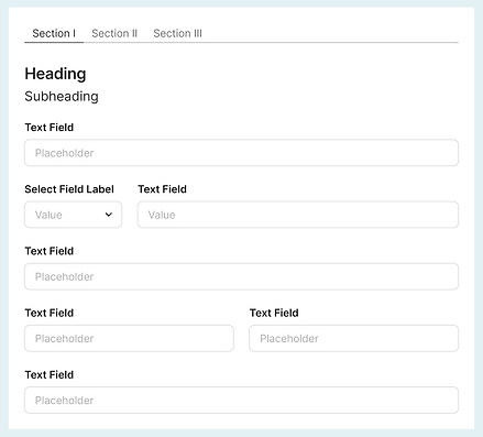
Form Structure
- Design easy to scan, understand and complete forms.
- Organize fields in a logical, intuitive order that reflects user expectations.
- Start with simple, non-intrusive questions before asking more complex or personal ones.
- Group related fields into clear, logical sections.
- Use a single-column layout to avoid misinterpretation and streamline form completion.
- Use multiple columns only when fields are closely related in logic and meaning, such as Start Date and End Date.
- Adjust field widths to roughly match the expected length of the input.
- Avoid using all caps in form text, as it reduces readability.
- Use Title Case for formal contexts (e.g., 'First Name'). Use Sentence case for informal contexts or labels longer than five words (e.g., 'What is your date of birth?').
- Keep labels short, clear, and descriptive.
- De-emphasize secondary actions to minimize the risk of user errors.
- Provide clear visual feedback (e.g., success message or confirmation animation) after form submission.
Form Spacing
- Consistent margin improves readability and is aesthetically pleasant.
- Use the below Base Unit (4, 8, 16, 24, 32 etc.) for the space between UI elements.
- Avoid sticking components too close or putting them too far away from each other.
- Apply the Proximity Principle to create visual grouping of form elements.

Before & After examples
Now that we've covered all the guidelines for designing efficient and easy to understand forms, let's take an example of a form with poor usability and apply what we learned to improve it.
Before

After

The second form follows a much clearer structure, it doesn't feel that heavy and promotes compeltion.
If you have any questions, suggestions for improvement, or a challenging case, I’d be happy to hear from you!